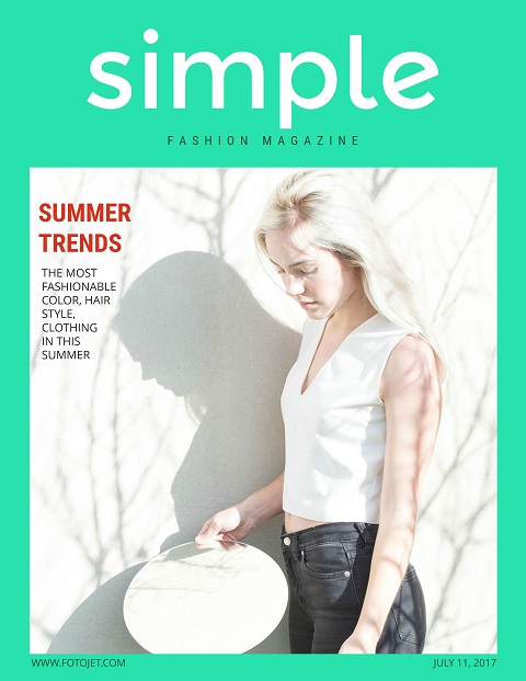
Tips on How to Make a Magazine Cover
Magazines still can not be replaced as the media evolves constantly. People are motivated to buy magazines with attractive covers. Since the magazine cover counts a lot, designers exert all their energies to get some eye-catching cover designs.
How to make a magazine cover creatively is a great challenge, especially for those who are not skilled in graphic design. Fortunately, there are various online designing websites available, which can assist you in creating delicate design even you are just an absolute beginner. Here are some tips designers should know to create a magazine cover:
1. Keep target audiences in mind
There is no possible to let everyone interested in your magazines. So a good designer always take target audiences into account. Think about who will read the particular magazine and what they want to see, then you can come up with some ideas that will attract those target audiences. For example, Sports magazines aim at people who take an interest in sports. Therefore, magazine cover designs that keep sport lovers in mind should be very helpful.

2. Reasonable placement and typography
It will come as no surprise that typographic is extremely important as well as the placement on the magazine covers. It is the case of creating the most visible and harmonious combination of image, text and background. and it is important to show the reader the more important content than others in a showy way and create a readable structure with the help of typographic hierarchy. For example, the title will be styled in a bigger font than the rest part such as subtitle and other details.

3. Be careful with the text
The use of color for the text on covers is extremely important. It will affect the tone and overall feeling of the cover. When thinking about text colors for subtitles and other smaller text, black and white are always be selected. But for the bigger title, you can choose some bright colors.

Make sure your text representative and attractive. Take some advice from the magazine editors about the text since they are more familiar with the content. If you're using AI tools to draft headlines, consider reviewing the final copy with QuillBot AI Detector to ensure clarity and originality. Don't place very long sentences on the cover with simplex format. Readers will get bored if the text doesn't have proper and attractive format. Numbering and alignment should be used in such a way that it would get more attention.
4. Choice for photo and background
Mostly the photo takes up the largest space of the layout and it is the spotlight of the magazine cover. So the importance of picking a catchy photo should be emphasized. If you feature a person's portrait on the cover, just let it look at the camera. The photo with eye-contact will be even better to draw the attention of the readers.

It is also recommended to put the photo on transparent or solid color background, which can help the text and photo stand out. It will be a little troublesome to make people recognize the headline and titles from a mixed-color background.
5. Get magazine cover ideas from everything
The inspiration does not spring up all the time. Sometimes designers are stuck of special ideas because they can not free themselves from the shackles of the design which they have used earlier. The best solution is to keep mind open and then you will find that inspiration may turn up from everything. Take notes when you get some good ideas before they vanish.
Conclusion
In a word, the tips above give a designer plenty of room to get creative magazine cover ideas, but there are still many more techniques waiting for explore. It may seem simple at first, but creating magazine covers needs a lot of efforts. It's a matter of keep trying, over and over again, until you find more tips on how to make a magazine cover and get the right result.


